Task brief:
Within our assigned teams we we’re asked to create one or several short animations that summarise the content of the article “Deforestation explained”, the aim of the task was to get us to experiment with expressive typography to help inspire and kickstart our Greenpeace brief.
For this task I worked with Zafri.
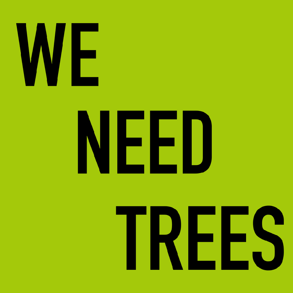
Our animations needed to grab a viewer’s attention in a short amount of time and give a short and concise message on deforestation.
Ideally the GIF’s should start defining the problem, then it should highlight major causes, and then finish with what can be done and a call to action. The main aim was to effectively communicate the content and the idea of deforestation and decline.
Referring to the demonstration we were shown in class we needed to create a set of slides in Adobe Illustrator of our storyboards first, then using Adobe Photoshop put together all the individual frames and play around with frame rates and the ordering of the frames.
The typographic style we chose needed to be dictated by the ones we had successfully experimented with for the last task (expressive typography).
Thing we considered:
- Using a font with high legibility and appropriateness for this type of media
- Using one of the typographic effects/manipulation applied before in Project 2, to try convey the idea of deforestation and decline
- Making the text short, punchy and memorable
- Including some of the data presented in the article, to emphasize the content and typography
- Applying colour to stress some of the messages
- Using interesting transitions and graphic elements to tie it all together